Human-AI Interaction · AI Safety · Research & Evaluation · AI Experience Design

Human-Centred AI

I design and prototype AI experiences in Figma, then validate them with usability testing.

I focus on trust calibration, uncertainty communication, and verification cues for LLM and multimodal systems.

ColdFit: SUS 90 (guided), n = 8 · LLM Literacy Cards: large belief change (d = 0.89) and medium–large shifts in scenario-based responses (d = 0.71), n = 49

Featured Work

Designing for AI Systems

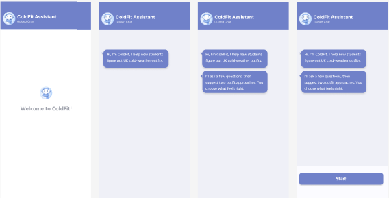
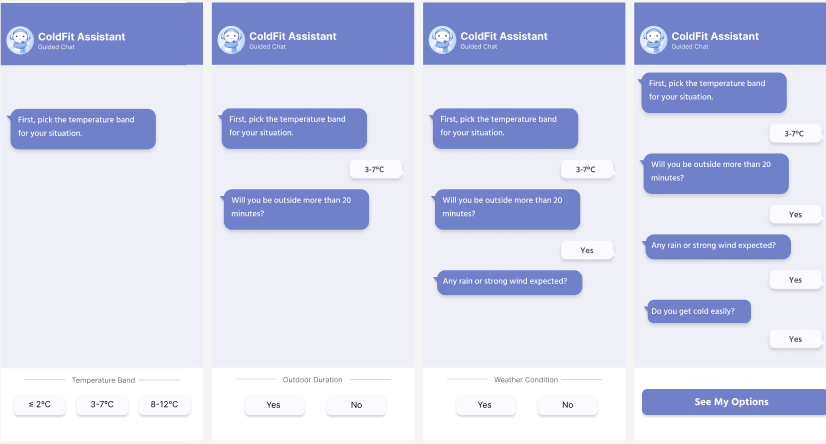
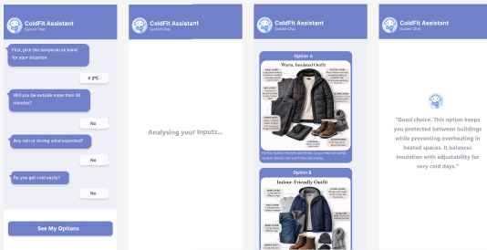
AI Decision-Support Experience
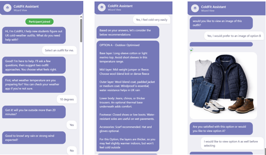
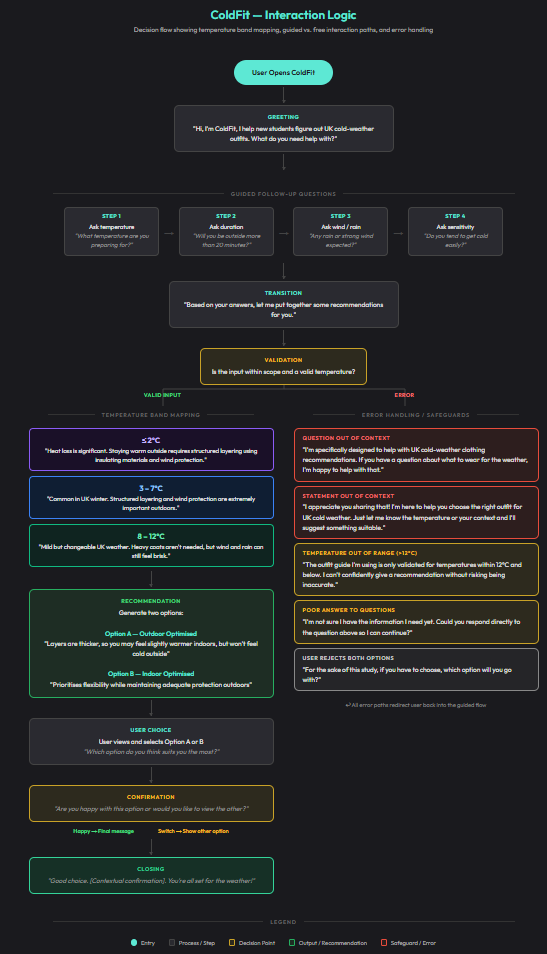
ColdFit

A multimodal AI clothing assistant that helps international students make confident, climate-appropriate clothing decisions in UK winter. I designed the interaction flow, recommendation language, visual-output strategy, and study plan, then measured how different interface structures affected autonomy, effort, trust, and decision confidence.

View Case Study
ColdFit welcome screen showing the AI assistant greeting
Study Conducted

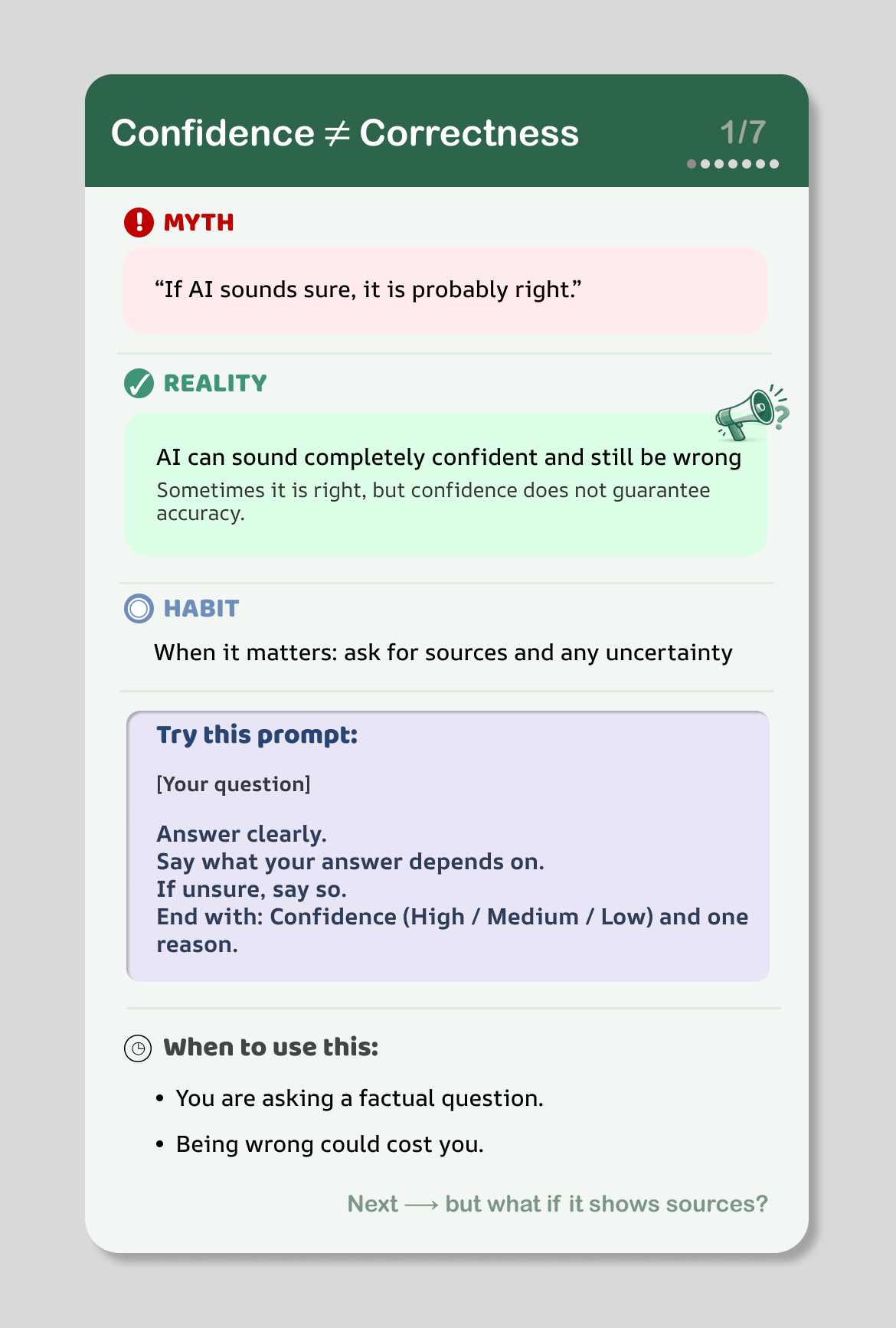
Educational Micro-Intervention
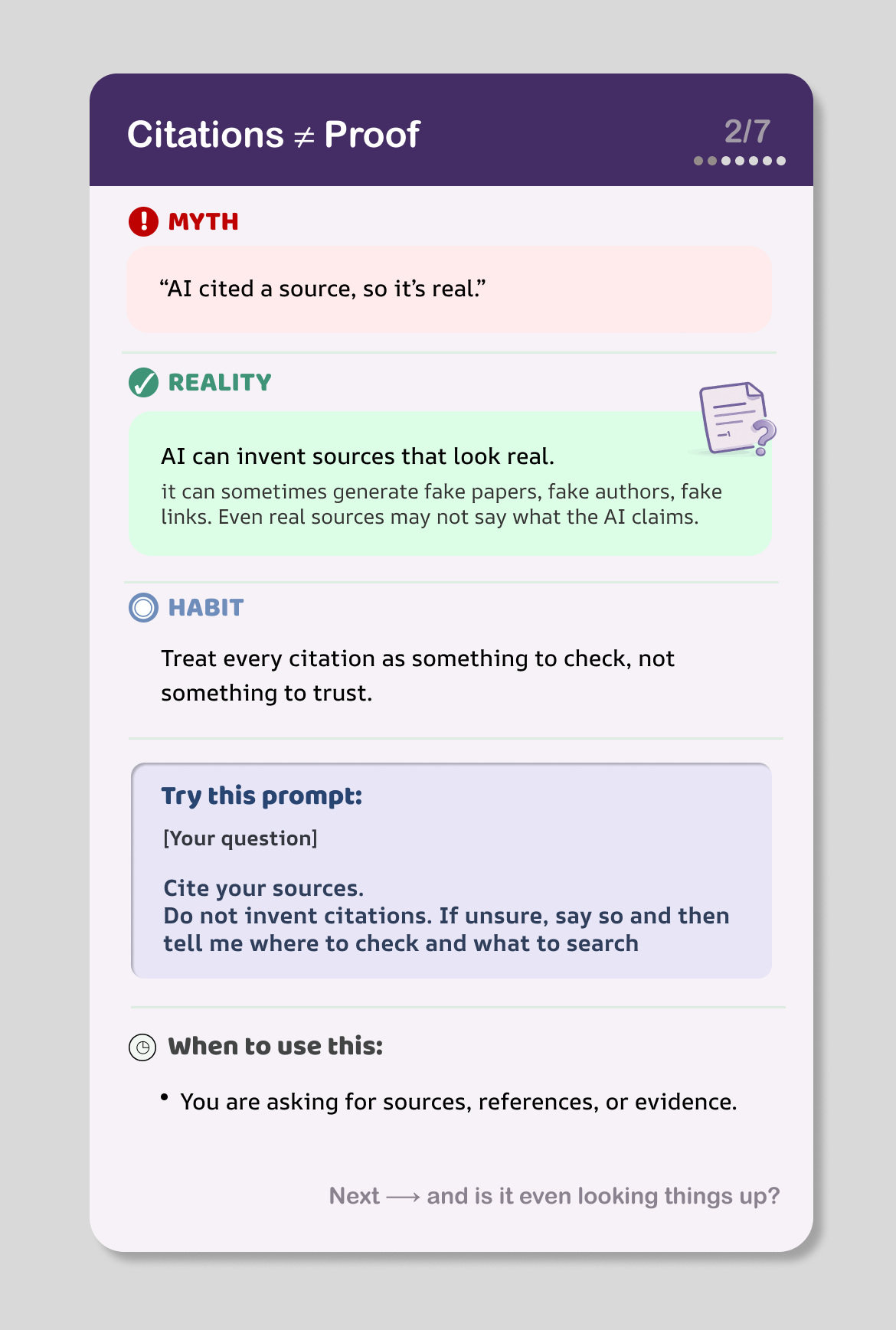
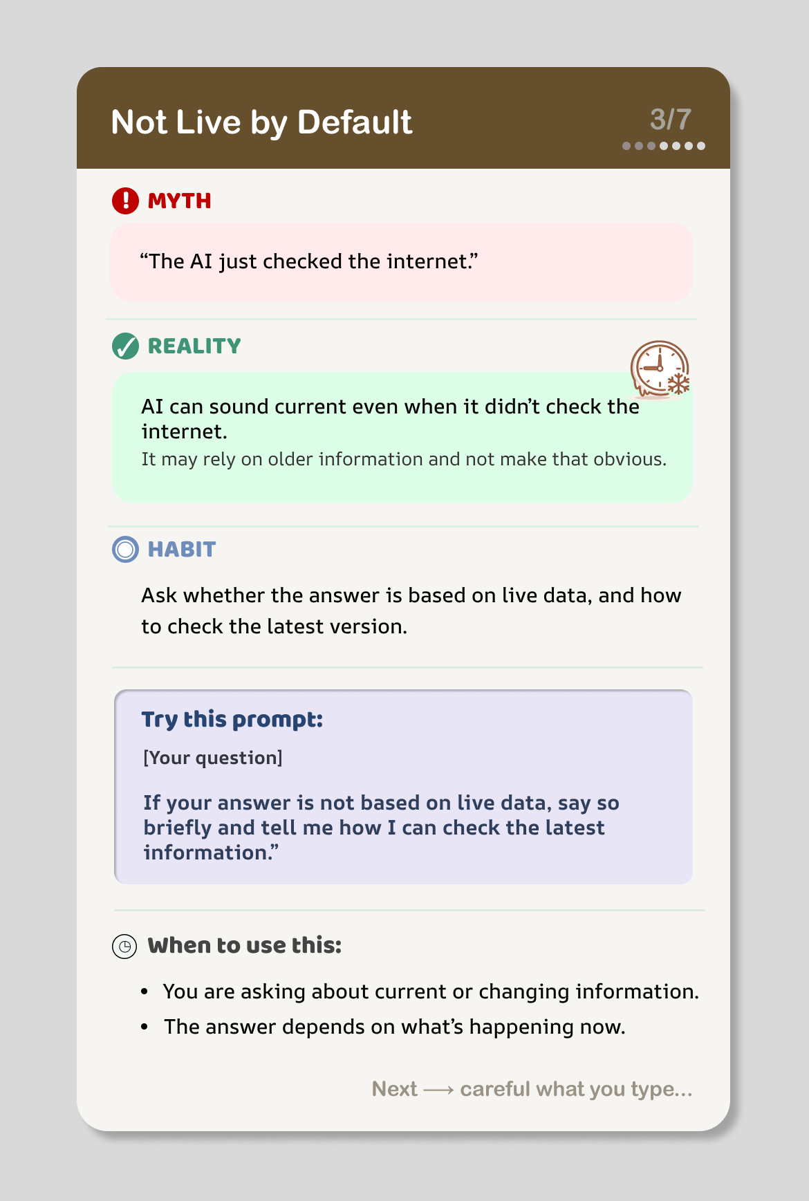
LLM Literacy Cards

Seven myth → reality → habit cards targeting common LLM misconceptions. Built a three-layer LLM-as-a-judge evaluation pipeline and ran a Prolific study (n=49), showing large belief change (d=0.89) and medium–large shifts in scenario responses (d=0.71).

View Case Study
LLM Literacy card showing myth-reality-habit framework

Case Study

ColdFit

Designing interaction patterns for an AI decision-support experience — a multimodal system supporting climate-adaptive clothing decisions.

Context
Cambridge MPhil, HCI Module
Duration
4 weeks
Methods
Mixed-methods evaluation, 2×2 design
Output
Figma prototype, CHI-format report

Results Snapshot

Study: 2×2 mixed-methods design, n=8 (guided vs. free chat × text-dominant vs. image-dominant output)

SUS: 90 (guided) · 80 (free)

Key takeaway: Guided interaction improved speed and usability; free chat increased autonomy but required more effort.

Design implication: Hybrid approach recommended — structured onboarding with the option to switch to free input.

Problem

The Gap Between Forecast and Feeling

International students often misinterpret UK temperature forecasts, leading to discomfort and uncertainty. Numerical weather data doesn't translate into embodied understanding — knowing it's 8°C doesn't tell you what to wear if you've never experienced 8°C.

I designed an AI decision-support experience to translate abstract weather data into confidence-supporting, embodied clothing decisions.

My Role

End-to-End Design & Evaluation

Interface Design

Screens & Flows

ColdFit welcome screen setting expectations before the user asks anything
Welcome screen — establishes the system's scope and sets expectations before the user asks anything.
Guided interaction with structured clarifying questions
Guided interaction — the system asks structured clarifying questions to narrow the recommendation space.
Image-dominant recommendation output in guided mode
Recommendation output (guided) — image-dominant output with labels included.
Free interaction with text and visual recommendation combined
Free interaction plus recommendation combining text guidance with visual outfit suggestion.

AI Interaction Design Patterns

Making the AI Explicit

Rather than hiding the AI's decision-making, I designed interaction patterns that make its reasoning legible to users.

Clarifying Questions

The system narrows ambiguity before recommending. Instead of guessing context, it asks targeted questions about activity type, exposure duration, and personal cold sensitivity — reducing hallucination risk.

Safeguards

When inputs fall outside the system's scope (e.g., medical advice, extreme weather), it explicitly declines rather than generating unreliable output. The refusal is designed to feel helpful, not dismissive.

Trade-off Framing

Rather than presenting a single "correct" outfit, the system offers two structured options: Outdoor-Optimised and Indoor-Optimised. This helps users compare warmth, flexibility, and indoor comfort, while keeping the final decision with the user.

Transparent Logic

Each recommendation includes brief reasoning about why certain layers, outerwear, or accessories are suggested.

Interaction Logic

How the System Thinks

Decision flow showing temperature bands, interaction paths, and error handling
Decision flow showing temperature band mapping, free interaction paths, and error handling as Wizard-of-Oz template.

The system maps UK temperatures into three experience bands, each linked to a clothing strategy. The guided path walks users through structured questions; the free path parses natural language and flags missing context.

Error handling is designed to be graceful: unrecognised inputs trigger clarification requests rather than generic error messages, and the system explicitly distinguishes between "I need more information" and "this is outside my scope."

Constraints & Trade-offs

What Shaped the Design Decisions

Evaluation & Validation

What the Data Showed

Metric Guided Free
Participants 8 participants (2×2 design)
SUS Score 90 80
Perceived Autonomy 4.61 5.19
Cognitive Effort 4.94 5.44

Key Insights

Prototype 1: Guided flow (structured questions) Prototype 2: Free chat + recommendation output CHI-format report (PDF)
Study Conducted

MPhil Dissertation · Human-Inspired AI · Cambridge

LLM Literacy Cards

Seven myth → reality → habit cards that address common misconceptions about large language models. I designed the cards, built a three-layer prompt evaluation pipeline to select the most effective prompt per card, and ran a Prolific pre/post study (n=49) showing large belief change and medium-large behavioural intention change.

Results from a pre/post study conducted as part of an MPhil dissertation at the University of Cambridge (2026). Full analysis and write-up in progress.

At a Glance

What this project delivered

7
Misconceptions addressed, from confidence calibration to neutrality bias
d=0.71
Medium-large composite effect on scenario-based behavioural intentions
94%
Participants rated the cards as useful or quite useful

Final Design

Three of the seven cards

Each card follows the same structure: a myth users commonly hold, the reality behind it, a habit to form, a tested prompt to copy, and triggers for when to apply it. Colour-coded headers group the misconceptions visually. Micro-icons reinforce meaning without adding cognitive load.

Card 1: Confidence does not equal Correctness
M1 — Confidence ≠ Correctness
Card 2: Citations does not equal actual proof
M2 — Citations ≠ Proof
Card 3: Not Live by Default
M3 — Not Live by Default

Problem

Overtrust and misinterpretation

Many users over-rely on LLM outputs or misread what they are seeing — treating fluent text as factual, assuming citations imply verified sources, or believing the system has live web access or persistent memory. Past behaviour data from the study confirmed this: 35% of participants had used a chatbot answer as-is without checking, 35% assumed chatbots remember prior conversations, and 22% shared personal details without modification.

Design Decisions

Myth → Reality → Habit, with a tested prompt

Three-stage hierarchy. Myth is emotionally engaging and quoted in the user's voice. Reality is a single concise sentence. Habit is actionable and phrased as a rule of thumb, not a lecture.

One misconception per card. Reduces cognitive load and lets each card function as a standalone reference. Mobile-first layout with clear visual separation between stages.

A testable "Try this prompt" box. Every card includes a copy-able prompt — not a slogan. The prompt text on each card is the version that won a three-layer empirical evaluation against alternatives.

Micro-icons only. Consistent iconography (warning for myth, check for reality, target for habit, clipboard for prompt) supports rapid scanning without decorative clutter.

"When to use this" triggers. Each card ends with concrete situational cues — turning the card from information into a decision aid.

Technical Evaluation

A three-layer pipeline to select each card's prompt

For each misconception I drafted a baseline prompt, a structured prompt A, and a lighter-touch prompt B. Rather than guess which would work best, I ran all 21 prompts through an LLM-as-a-judge pipeline — 105 generated responses, 285 pairwise judgements, and 315 absolute scores — to make principled selections.

Layer 1 — Generic quality screen. All 105 responses scored on task responsiveness, clarity, and appropriateness. 105 of 105 passed.

Layer 2a — Pairwise comparison. Head-to-head comparison on misconception-specific criteria with position randomisation. Guided prompts beat baseline on all 7 misconceptions.

Layer 2b — Absolute adequacy. Each response scored individually. A prompt qualified only if its mean reached 2 ("adequate") on every criterion — a rubric-grounded threshold that avoids arbitrary cutoffs.

Layer 3 — Usability proxy. Among qualified prompts, the one with higher naturalness and lower burden was selected. This ensures prompts are not just effective but adoptable.

Prompt Selection

Which prompt won for each card

CardMisconceptionSelectedReason
M1Confidence ≠ CorrectnessStructured AOnly A beat baseline (60% vs 40%)
M2Citations ≠ ProofLight BBoth qualified; B more usable
M3Not Live by DefaultLight BBoth qualified; B more usable
M4Don't OvershareLight BBoth qualified; B more usable
M5Advice ≠ Safe to Act OnLight BBoth qualified; B more usable
M6Memory ≠ RecallLight BBoth qualified; B more usable
M7Neutral ≠ UnbiasedStructured AOnly A beat baseline (93% vs 20%)

Emergent Finding

Localised vs distributed correction

The pattern

For localised corrections — adding a verification step, flagging a privacy concern, disclosing memory limits — the lighter prompt was sufficient. The model could do its normal thing and append the required element.

For distributed corrections — recalibrating certainty language throughout the response (M1), or restructuring how contested viewpoints are framed (M7) — only the structured prompt worked. The change had to happen in every sentence, not as a bolt-on section.

Human Study Results

Pre/post study with 49 UK adults via Prolific

Participants completed misconception belief items and scenario judgement tasks before and after viewing all seven cards. The study measured whether a single exposure to the cards shifted beliefs and intended behaviours.

Behaviour was measured using scenario-based decisions rather than self-report, capturing how participants would act under realistic conditions.

Misconception Beliefs (pre vs post)

MisconceptionPrePostChangeEffect
M1: Confidence2.102.82+0.71*d=0.65
M2: Citations2.062.86+0.80*d=0.74
M3: Web access1.762.45+0.69*d=0.54
M5: Memory1.822.65+0.84*d=0.64
M6: Neutrality2.222.76+0.53*d=0.46
M8: High-stakes2.522.67+0.15d=0.14
M9: Privacy2.273.33+1.06*d=0.88

Scale: 1=Agree to 5=Disagree (higher = more literacy-aligned). * p<0.005. Wilcoxon signed-rank test.

Scenario-Level Behavioural Intentions

ScenarioPrePostChangeEffect
M1: Confidence + time pressure2.392.96+0.57*d=0.53
M2: Citations behaviour2.613.06+0.45*d=0.45
M3: Live data / freshness2.883.10+0.22*d=0.31
M4: Privacy behaviour2.492.65+0.16d=0.16
M5: High-stakes trust3.433.59+0.16d=0.19
M6: Memory reliability2.883.24+0.37*d=0.31
M7: Neutrality / perspective2.452.96+0.51*d=0.46

Scale: 1-4 (higher = more literacy-aligned). Response options were scored using a card-aligned behavioural rubric. * p<0.01. Wilcoxon signed-rank test.

Key takeaway

A single exposure produced large shifts in user beliefs (d = 0.89) and medium–large improvements in decision behaviour (d = 0.71), particularly for confidence calibration, citation checking, and neutrality awareness.

Get in Touch

Available from June 2026. Open to internships and entry-level roles :

Product Design (AI experiences) · AI Experience / Conversation Design · UX Research (AI products)